Monday, 9 May 2011
Wednesday, 4 May 2011
Location- In our opening sequence we used establishi
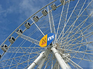
ng and close up shots to show that our film is set in Manchester by including key features of the city such as the shops in town, th
e Printworks and The Big Wheel. This is in similarity to ‘Confessions of a Shopaholic’ as there are many shots
to show New York. We used Mancheste
r as our location in our film as it is very similar to New York as it is a lively and exciting city with a great night-life and many designer stores and shops. American programmes such as 90210 and Ugly Betty also use many establishing shots to show the location. Furthermore in the first few seconds of our opening sequence we included a shot of stores such as Selfridge's and Louis Vuitton in order to hint at the story in our film.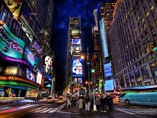
Title- After a group vote we chose the title 'In your dreams' for our opening sequence. We chose this as it perfectly represents exactly what our film is about especially as the first part of our film is about the character dreaming. We decided to use a bubbly font for our title as it looked dreamy and therefore symbolized the story in our film. The title and credits were written in the colour white on a black background as it would make the title and credits stand out, furthermore the colour white connotes a dream. 'Sex And The City' and 'Mean Girls' which have similar themes to our movie also have used similar fonts and colors in the title of their films.


2. How does your media product represent particular social group?
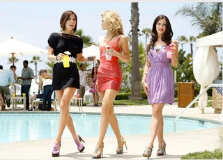
Our opening sequence introduces a protagonist who is a shopping addict and she dreams about shopping from very expensive shops where in reality she is in debt due to her shopping addiction. However it is not clear to the audience that’s she’s having a dream until the blackout. We picked a very pretty female character who is a young adult to fit in with the story line. We chose a female character because in society it’s stereotyped that women like to shop more than men and usually shopping is seen as a woman’s hobby.

This shows that younger women are more interested in shopping and that’s why we chose a young female character. Our opening sequence also highlights consumption and materialism in a time when many people are facing financial struggles which is relevant now due to the recession.
The character is dressed up with trendy clothes, high heel boots, hair and makeup also done which implies that she cares a lot about her appearance which is linked to why she’s a shopping addict. In this film the protagonist is from a white background that’s because she’s from Hollywood and usually in films like that the main character is more likely to be presented as a “dumb blond”. These kinds of films are usually set in America. She’s also from the middle class as we assume that she would need the money to buy that amount of shopping even though we know she’s currently in debt but that’s due to her shopping addiction.
3. What kind of media institutions would distribute your media product and why?
Our film has been greatly inspired by ‘Confessions of a Shopaholic.’ This movie is a big budget Hollywood film and is a Jerry Bruckheimer Films and is distributed by Touchstone Pictures. Touchstone Pictures was established in 1984, and is one of several alternate film labels of The Walt Disney Company. The company typically distributes more mature themes than those that are released under the Walt Disney Pictures banner. Our film however is going to be of a much lower budget therefore we can’t expect such a huge and well-known company to distribute our film. After doing research we have decided that Working Title would be a much more appropriate distribution company to distribute our film.

The main audience for our media product is teenage girls and young female adults. We have specially chosen this target audience because the protagonist is a female and the movie is based around her life and the troubles she faces through her addiction of shopping. However men may also be able to relate to the comedy element of the film too.
The genre is a romantic comedy and we have decided to rate it as PG as ‘Confessions of a Shopaholic’ is a similar genre to our movie. PG means Parental Guidance, which means that some of the elements in the film may not be appropriate for all audiences and it is up to the parents whether they let their child watch it.
The genre of the opening sequence is a romantic comedy and we used varied methods to portray this genre. Firstly we deliberately targeted the film at a specific age range, which are females 15-25. We then chose the title to be ‘In your dreams.’ We brainstormed a few possible titles and we chose this because it relates to the target audience and the genre of the film.
There are quite a few aspects in this opening sequence that relates to the target audience. Females can relate to the opening scene of our movie as some women aspire to be independent and also women enjoy spending a lot of money on shopping for themselves.

We also filmed in a bedroom, the bedroom is important because it’s a personal space in which many women spend a lot of their time. We also had naturalist bright lighting to replicate a Hollywood type of film. Luckily on the days we were filming the weather was dry and sunny. Also in our opening sequence, we used upbeat music to ensure that the viewer knows from the very beginning what genre the film is.
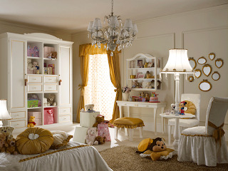
From the preliminary task we were confident about the use of the camera equipment and we developed an understanding about how to undertake different shots with the tripod and camera. We experimented with different shots and angles, including high and low angle, over the shoulder, close up and establishing shots. Also we filmed many scenes numerous times to ensure we had enough good footage to edit and work with.
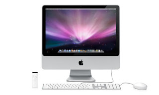
To edit our film we used Final Cut Pro which is a professional editing software application developed by Apple.

Before beginning to edit our movie we had to connect our camera equipment to the computer and transfer all the footage we needed onto the computer. The footage was then altered and cut using the 'mark in' and 'mark out' buttons on the keyboard on Final Cut Pro. We then selected the scenes needed and added them to the timeline. Once we had our timeline done we could then add effects and transitions.
Here is a screen shot of our timeline:
We also chose upbeat music that was perfect for the theme and genre of our movie and imported and added to the timeline too.
The text tool then let us input credits and the title into our movie.
 Our online blog shows all the steps we took from the beginning until the finale of our movie. On the blog we have also included location and costume pictures, ideas for the title of our movie and exclusive behind the scenes photographs.
From our preliminary task we have learnt to enhance our planning skills. All of the members in our group sat down and discussed any ideas we had for our main task; we also made notes and then had a vote on the best idea.
We then discussed locations and it was evident that a shopping location such as Manchester town or The Trafford Centre would be ideal for our theme of our movie. We decided to film in Manchester town because we wanted to do the filming in an outside location as we felt the lighting would be much better.
We filmed during our media lessons, as it was the ideal time for when we were all available.
We researched into our main character. In our preliminary task we didn’t do much research and we actually discovered that research was very effective and helpful. We wanted to portray our character as an independent woman who is pretty and rich.
We then created our storyboard, which was the basic outline of our opening sequence. We had to decide what order the scenes would go in and what was going to happen in each frame. However during the filing we added more scenes especially during town when we added the entertainer to add a comedy element and the scene where the protagonist is walking with the big wheel behind her. We particularly liked this as it establishes the location and represents Manchester.
We learnt how to make our own soundtrack with Garage Band as we were not permitted to use an existing commercial song as we were planning. However we decided for our final product we decided to use a copyright free tune from YouTube.

From our preliminary task we also learnt how to use the 180° rule. If we had not taken this rule into account the film would not have smoothly and the footage would look odd.
 Overall the preliminary task was incredibly useful as it helped us to be cautious during our main task and it enhanced our camera skills too.
Friday, 15 April 2011
Questionnaire

After the completion of our media product we asked a group of ten of our peers about their opinions of our opening sequence.
7 out of 10 said they really enjoyed it whereas 3 people said they did not enjoy it as it was not a genre they were interested in. This reaction was particularly interesting as the 3 people who said they would not enjoy it were males.
6 out of 10 said that they would be interested in watching it as a real film plot.
6 out of 10 found our editing effective and found the music was appropriate for our genre.
Overall the feedback we obtained was positive and really helped us to gain another perspective on our media product.
Monday, 11 April 2011
Inspiration for the editing of our opening sequence

Monday, 4 April 2011
Inspirations for the soundtrack for our film

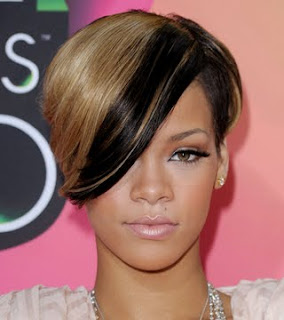
David Guetta ft Rihanna - Who's That Chick http://www.youtube.com/watch?v=BOdmf4N5aPE&feature=related
However we are not allowed to use commercial songs in our movie as it is copyright so we are either going to create an original track in Garage Band or find an existing track from the internet which we are permitted to share.
Tuesday, 29 March 2011
Behind the scenes
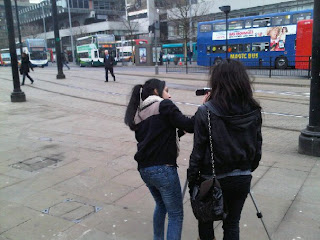 This was taken in Picadilly Gardens whilst we were filming the trams however we have not used this particular shot in our media product.
 This is a shot in the character's bedroom an this is a shot of the bills on her bed which indicates the great level of debt she is in.
This is a shot of the character as she awakes from her dream and comes back to reality. The character looks shocked and distressed. She then falls onto the bed.

Storyboard
Monday, 28 March 2011
Audience and Genre

'In your dreams' is mainly targeted at teenage girls and is based around a romantic comedy. The movie is based around a woman's struggle as she tries to get out of debt and find a job in an attempt to sort her life out and get rid of her shopping addiction. She also falls in love during her struggle and the male character supports her financially and emotionally.

This is Jennifer Smith who is our typical target for this movie and this film would greatly appeal to her and her friends. She is 18 years old and lives in Ealing, London. She is currently studying at a sixth form college and has plans to attend university to study English. She is in intelligent young girl who also loves fashion and designer clothes. Being an only child her parents have given her all their attention,love and affection. Her favourite stores are Topshop, Selfridge's and Harvey Nichols. She attends the cinema regularly with her friends and loves chick flicks like St Trinians, Bratz, Confessions of a Shopaholic and 27 Dresses.
Ideas for the title of our film

We have decided the title of our film is 'In your dreams.'
We have chosen this name because the first section of our opening sequence is based around the female character dreaming, furthermore the character fantasizes that she is able to buy such extravagant and expensive clothes when in reality she is in debt due to her addiction to shopping.
Resume
Detailed shotlist
Close ups and wide and establishing shots of shop signs, shop windows and town
Low angle shot of girl coming out of a taxi
Long shot of girl walking towards the camera
Medium shot of girl and shop window
Long shot coming out of shop
Long shot of her walking away
Long shot of character looking in the mirror admiring clothes
Throwing clothes onto bed
Wide shot as she jumps onto bed
Close up closes her eyes
Blackout
Close up of shocked face
Zoom out
Recording Schedule
We are now going to spend the next two weeks editing our film whilst writing up our blog too.
Wednesday, 23 March 2011
Location analysis

This location is near St Ann's Square (Deansgate) and was where the majority of our film took place. St Ann's Square leads up to all the designer stores which was ideal for our theme. We chose this location over indoor shopping centres such as The Trafford Centre for example as this fits in with the Hollywood style we were aiming for.
 Louis Vuitton is a huge brand and is associated with the luxurious life. Our opening sequence wanted to convey this so this shot is ideal for our media product.
 Selfridge's is a well known brand all over the world and we certainly wanted to include this logo into our sequence as the store represents glamour and wealth.
 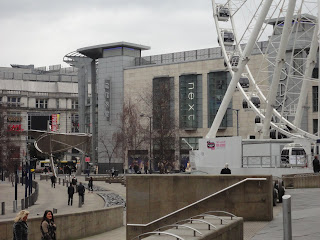 This picture is an establishing shot of Manchester. We believe this is essential to our our opening sequence as it informs the audience of the location and fits in perfectly with our theme of shopping addiction as Manchester is known for its incredible designer shops and The Trafford Centre.
Monday, 7 March 2011
Analysis of costumes
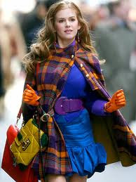
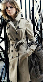

For the main task we wanted the protagonist to be presented as being rich,modern and fashionable therefore we have chosen clothes that are in fashion at the moment and are flattering for the character. Also the character is very self conscious and vain so the character is going to be pretty with a lot of make up and her hair done perfectly. Our protagonist, Sana, plays a young adult that has grown up with a desire to spend well beyond her means.


